What Exactly is a CTA and Why is it So Important?

A website without a CTA is like a birthday cake without icing. Sure, people may still take a piece, but everyone knows something is missing. Something important.
Your CTA is vital to the user experience of your website. Just take a look at any high-converting website, and you’ll notice they all have strong and compelling CTAs that foster the development of their online presence. No matter what your marketing objective may be — growing social media followers, increasing newsletter subscribers, setting up a meeting with consultants — it needs to be clear and effective. Because a CTA is the one thing that can actually turn clicks into customers.
So let’s dive into what a CTA is, why it’s so important to your strategy, and how you make yours really stand out.
What is a CTA?
A CTA (call to action) is a prompt located on a website, internet/digital ad, post, etc. that tells the user to take a specific and immediate action. They’re typically written as a command or action phrase — or one starting with a verb — to push customers from the browsing stage to decision-making stage.
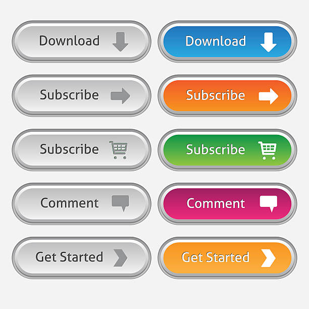
CTAs can take many forms. They may be a button, an image, text, or another creative element, but regardless of the look, it has to be well written, well placed, and well designed to be effective.
Why is a CTA So Important to Your Website?
CTAs encourage your audience to take deliberate action. They eliminate any confusion or uncertainty that causes friction through the sales funnel. Without a clear CTA, users may not know what the next step is, likely leading them to abandon the site before achieving it.
Some CTAs are just direct and simple like “Register Now” or “Call Us Today,” but the most effective and high end CTAs don’t just tell your audience what YOU want them to do; they offer insight into how that action will benefit THEM.
You can have more than one unique call to action, and on a website, you typically will. But consistency is important. See below for more components of a compelling CTA.
Key Components to a Strong CTA
- Research – Understanding your customer on a deeper level is important in order to speak directly to them. In addition to Voice of Customer Research, utilizing keyword research will help you optimize your SEO ranking and choose standout language that competitors aren’t using. But if something is working well for your competitors, then competitor analysis will help you position your CTA to be successful too.
- Placement – Where you place your primary and secondary CTAs is just as important as what you say in it. If the copy is compelling, you don’t need to shove it in their face with multiple pop ups. But making it easy to find is key. The best way to determine placement is to consider the flow of your site navigation and how users will move throughout your content and pages. A/B testing is a great plan to reveal the best placements for your unique site.
- Design /Colors – Typically, you want your CTA button to be consistent across your site pages in size and look. It should fit your branding style, but should also be a color that stands out, so focus on contrast.
- Wording – Just like the name suggests, the text of your call to action should urge a user to take action, so action words/verbs are key.
- Length – A good CTA isn’t a sentence; it’s a short phrase. Try to stick to no more than 5-7 words.
- Benefit – What will the customer get from clicking the button? Make sure it’s clear what they can expect from the action, and even better, what’s in it for them – ie. “Get Expert Tips” or “See How to Grow Your Business.”
- Urgency – Today more than ever before, it’s easy to get distracted online. By creating a limited time only offer or deadline, you can better encourage users to take immediate action versus putting it off until later.
To learn more about creating strong website CTAs that will help you drive action, contact shyft today. Our marketing consultants and digital specialists can help you elevate every aspect of your website design to communicate your brand story and convert more users into customers.
Recent Posts:

