Case Study: Nath, Goldberg and Meyer – Website Design and Development

Nath, Goldberg and Meyer
Law Firm Elevates Branding with Site Redesign & New Logo
Improved site functionality & branding aligns to match firm’s innovative capabilities
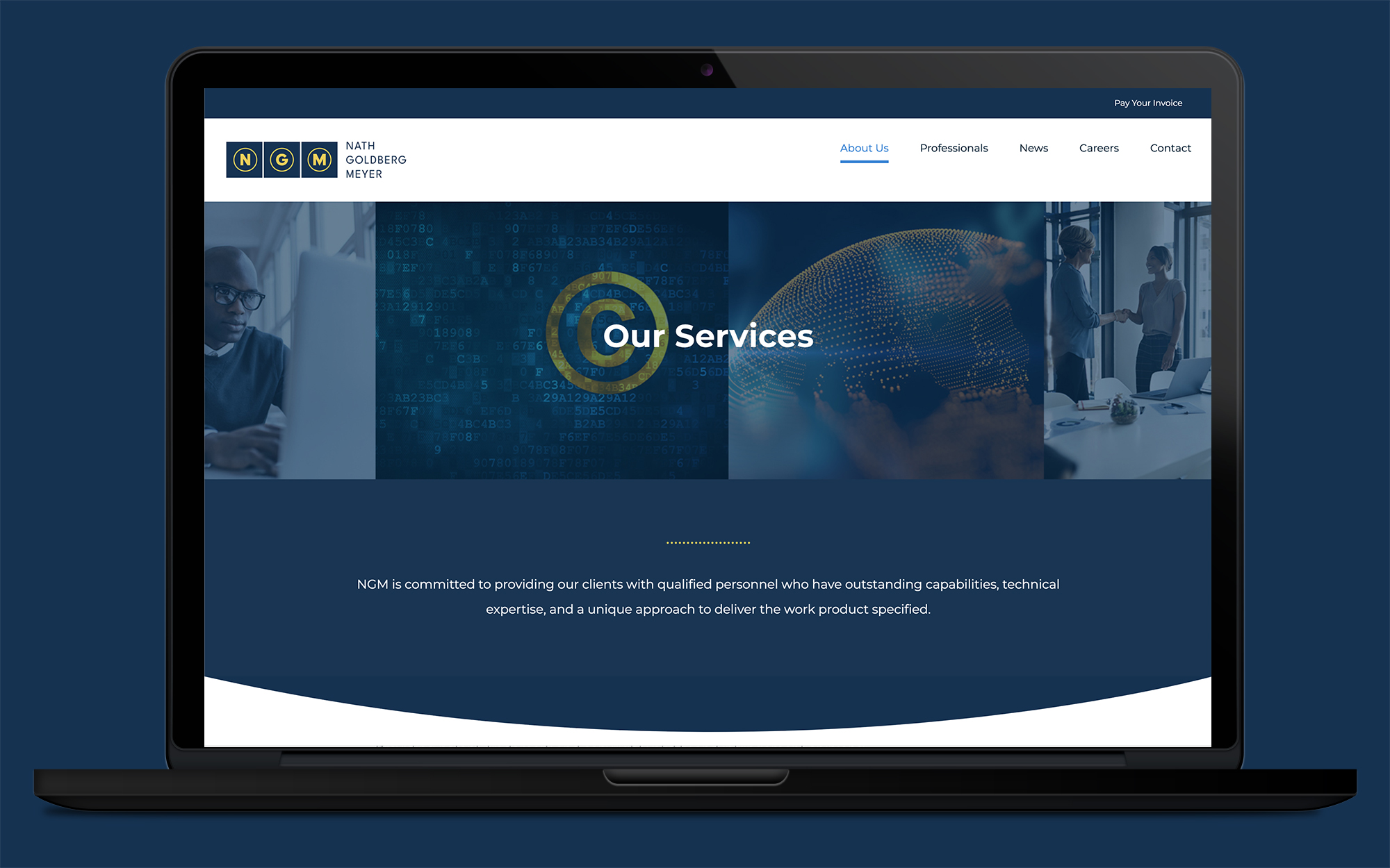
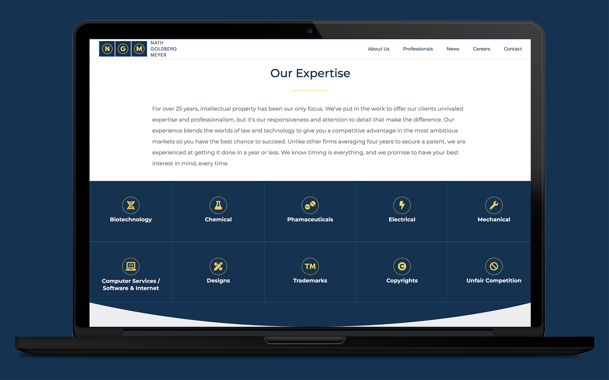
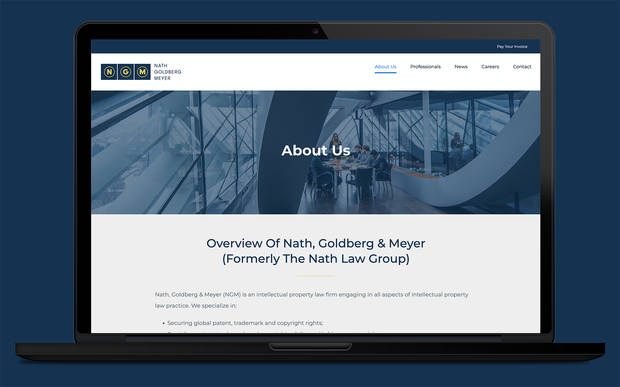
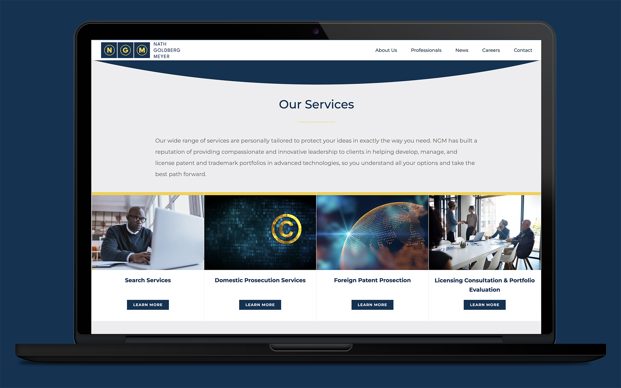
Nath, Goldberg, and Meyer, an intellectual property law firm based out of Virginia, asked shyft to redesign their website, as they realized it was very outdated and wasn’t representing the firm in the best light. During the discovery process, shyft recommended a redesign of their logo as well, which the client was completely amenable to.
The logo redesign offers three blue boxes with light gold initials, keeping in line with the color scheme the client requested. The three initials of the firm’s founders are contained in circles that are reminiscent of copyright/trademark symbols, which align to their core business offering. The circles also represent the global/worldwide nature of the firm.
The website redesign started with a new mobile-friendly WordPress template and newly-written content on the homepage that offered a new tagline and value-based messages that provides content to a visitor that draws them in and gives them an understanding of WHY Nath Goldberg and Meyer might be the firm for you. An easy way to navigate through to find their service areas, professionals, news/articles and a way to contact for more information is also presented in a simple and easy way.
View the site here.
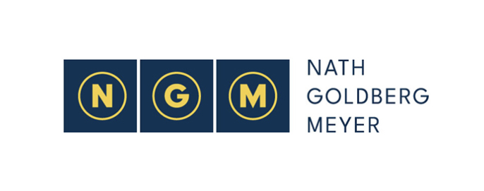
Logo Before | Logo After
