Case Study: Sounding Capital Partners – Website Design
Sounding Capital Partners
New Website Delivers Big Strategy for Small Investment Firm
A modern, mobile-friendly interface & strategic focus elevates this consultant’s brand
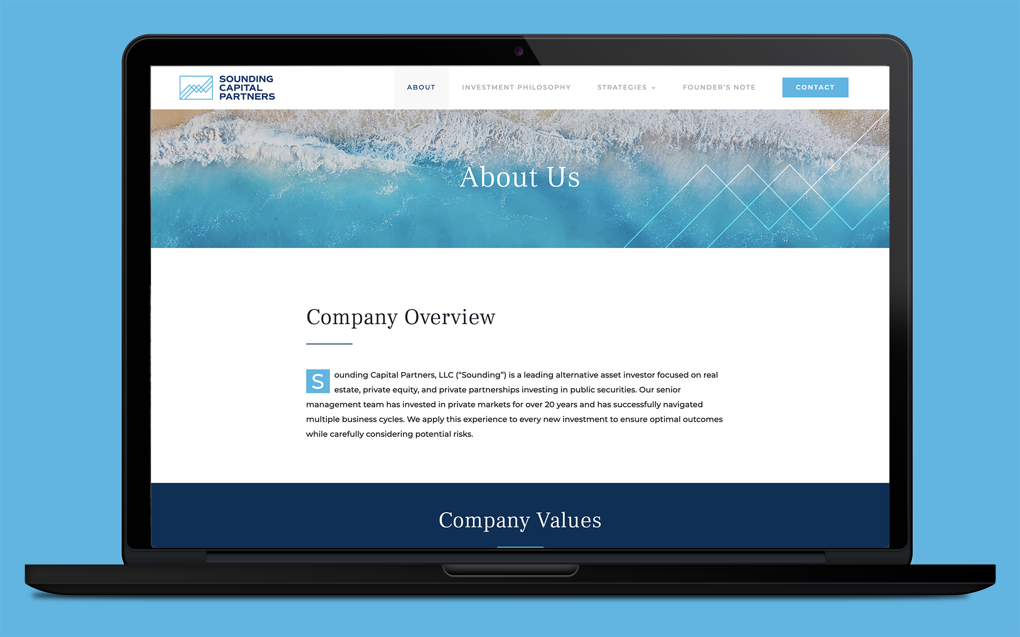
Sounding Capital Partners came to shyft in need of creating a new site that delivered the expectations of a large firm. Despite being a business run by one alternative asset investor at the time of launch, the site was designed to present big investment firm experience with a strong focus on values, speed to market, and responsiveness.
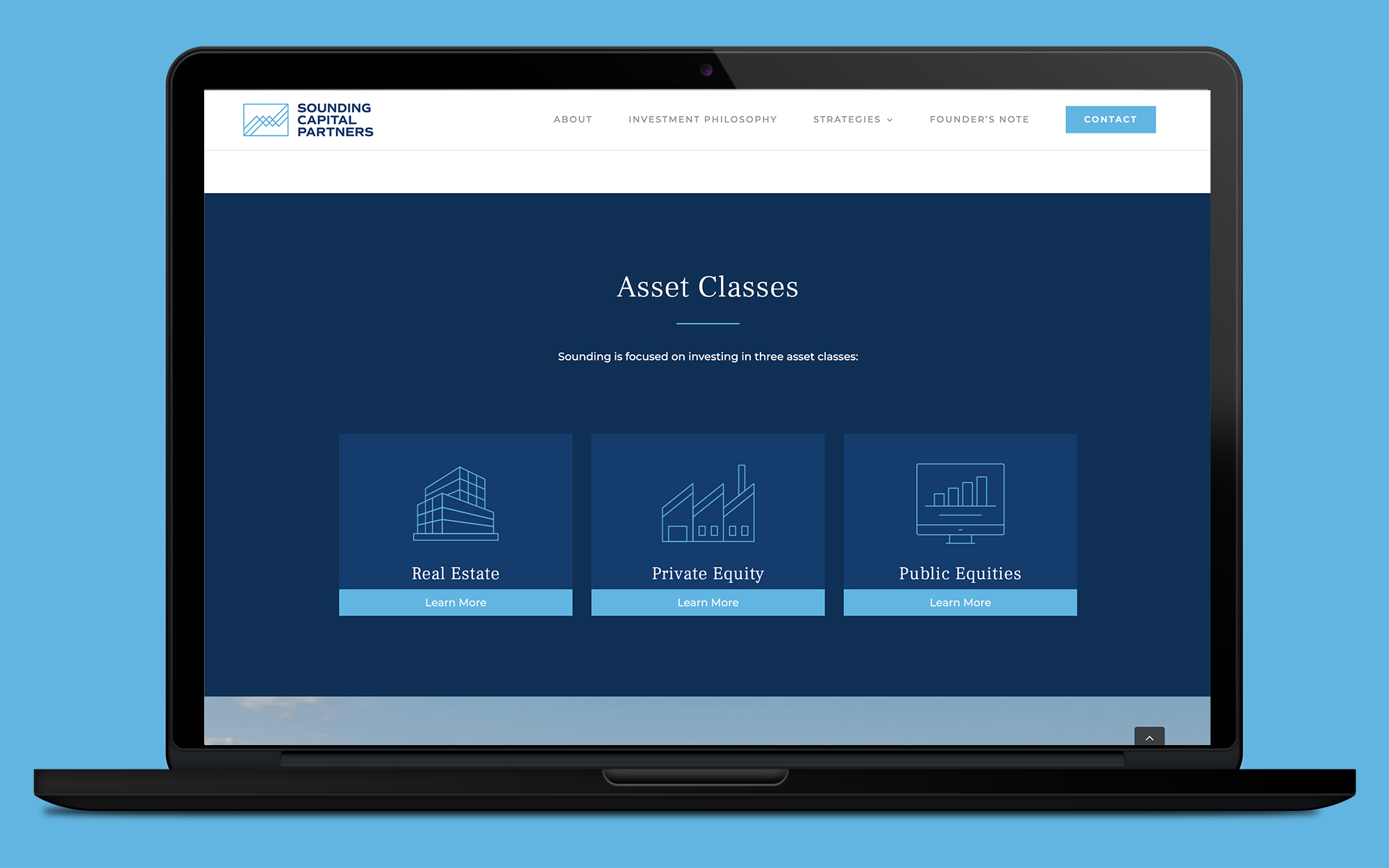
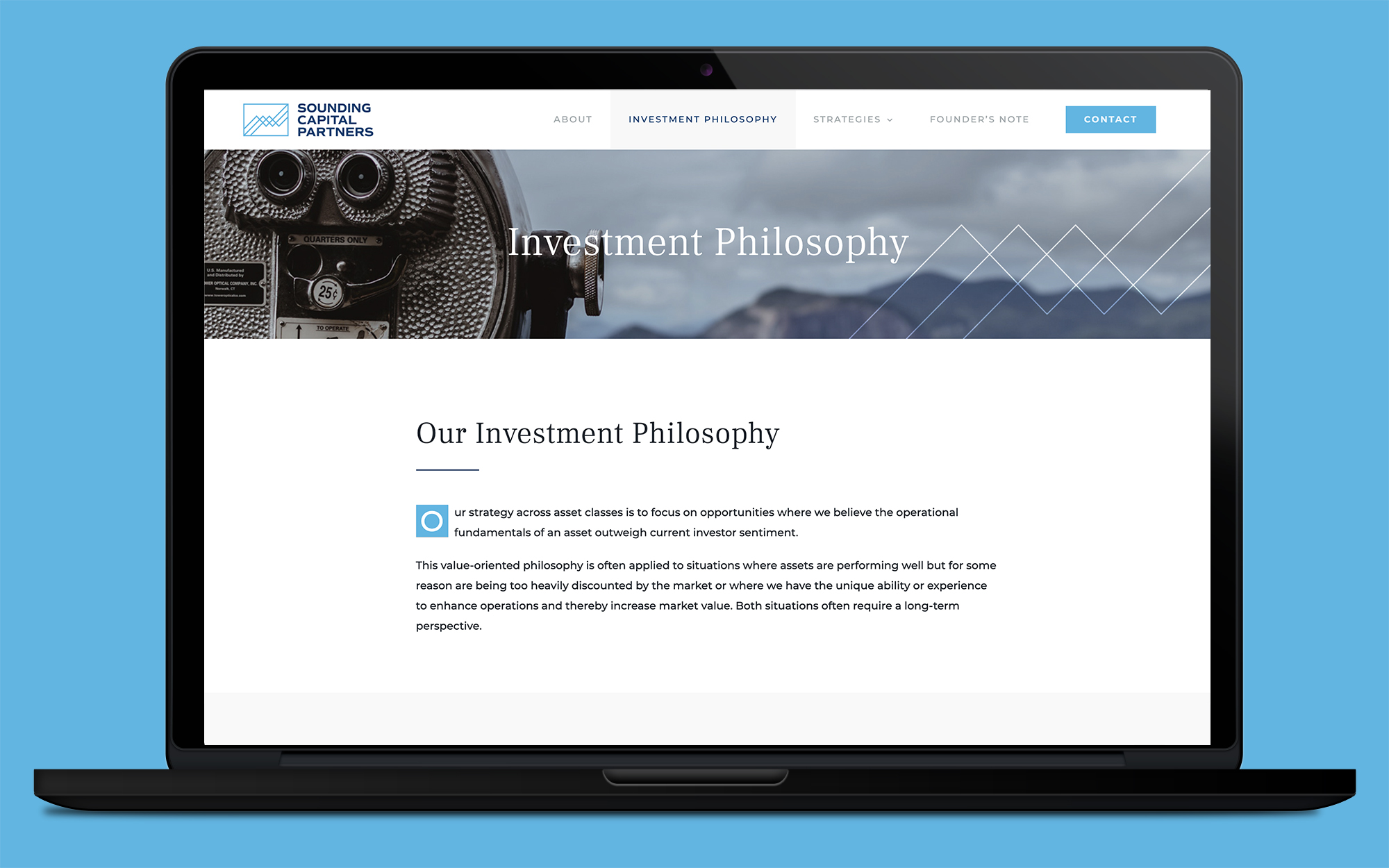
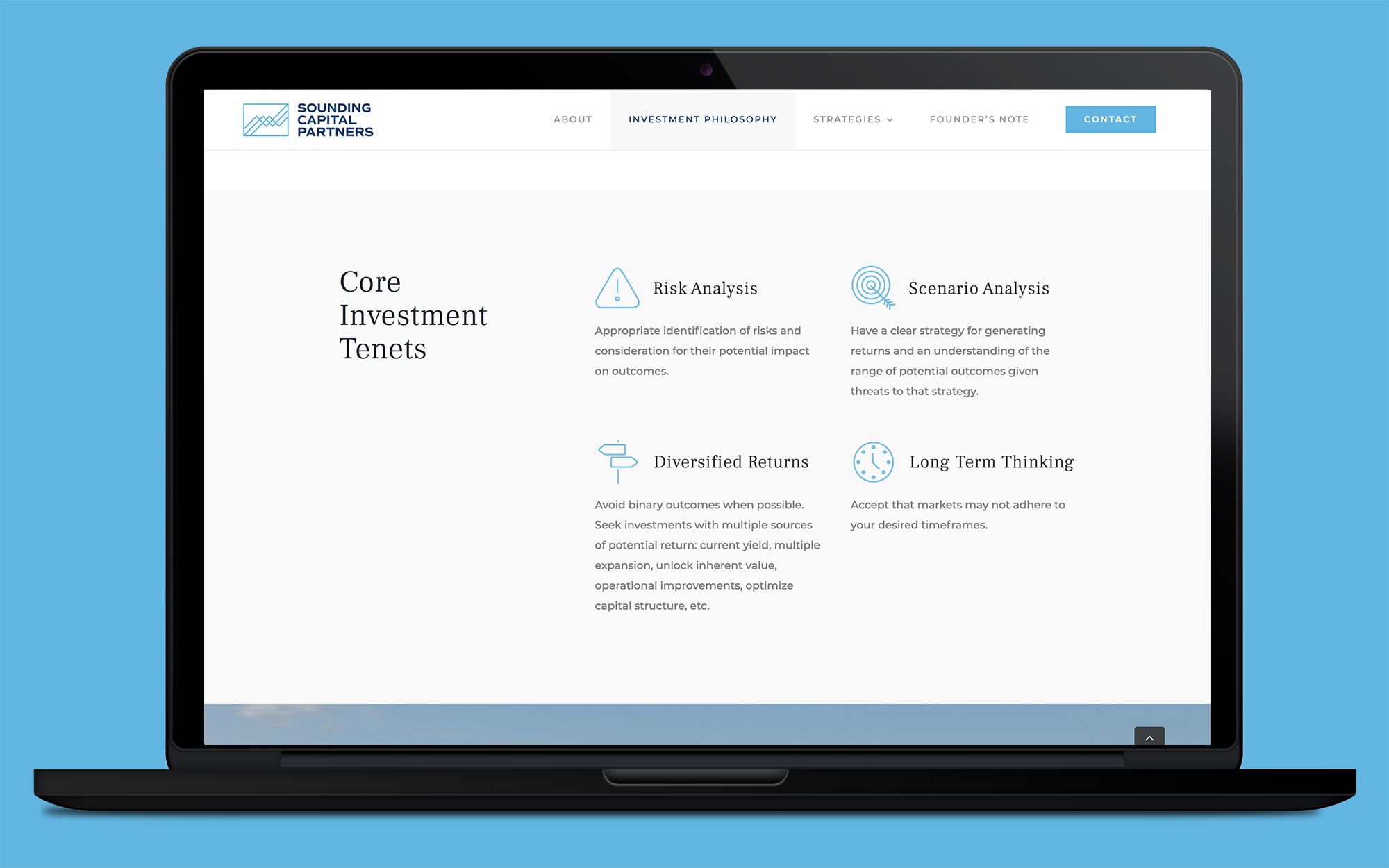
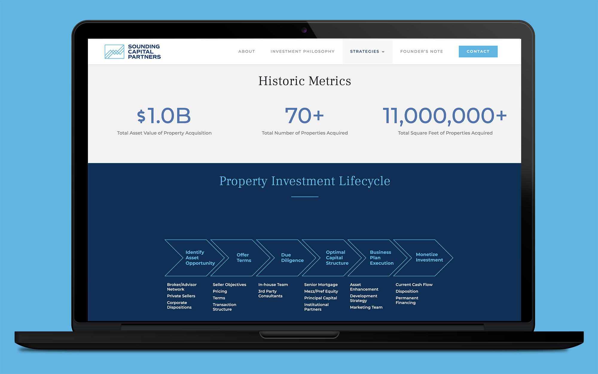
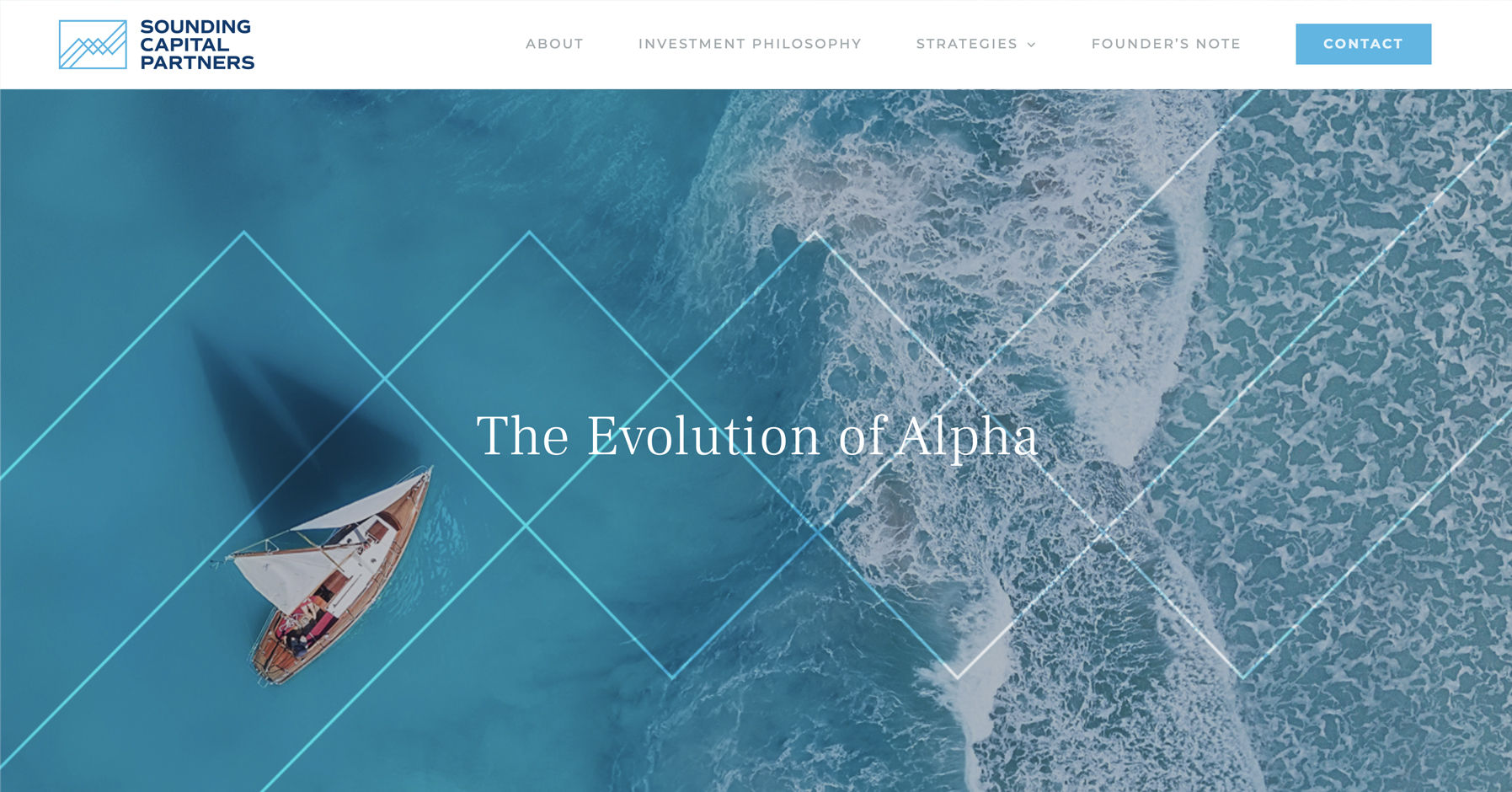
Sounding Capital Partners was launched to have an institutional feel with an entrepreneurial heartbeat. Using a simple WordPress template, the site was designed with easy navigation, a modern interface, and a mobile-friendly template. It also includes visuals such as charts and graphs to tell their story, plus a contact form with an easy call to action on each page, which encourages people to get in touch with a representative from the firm.
View the site here.


Logo Before | Logo After
