What Consumers Want to See on Your Website

You constantly hear how important your website is to your marketing. So you want one that makes you look like a big deal. While we admire your enthusiasm, your customers are actually more interested in the little things. The things that show your personality, give them a sense of trust, and make you seem real.
So what does that stuff look like? Well, some of it’s technical; some of it’s creative. But all of it is important to make a memorable first impression and keep them coming back. Creating a great website can be complicated, but don’t worry, we’ve done this a million times. So here are the top 8 things consumers want to see on your website.
Simple Navigation
50% of people who visit a page will look immediately at your navigation structure to orient themselves (Cludo). And nothing turns people away faster than making it too difficult to get what they came for. If your site navigation is not in a familiar place, you take the risk of them just leaving.
Here’s a tip: study usage patterns throughout your site. Which pages are driving the most traffic? Which content keeps people on those pages for longer? Your header navigation should make getting to these places as easy as possible. Search functions are also a great way to help them get to the most relevant sections of your site based specifically on what they’re looking for.
An About Us Page
This is where your customers look to see who you are and why you’re different. 85% of consumers say they’ll only consider a brand if they trust it. And that’s exactly why the About Us page is the second-highest rated element of a website (Hubspot). They want to know about the people behind the brand — the ones they’ll actually be working with (or at least giving their money to). But they also don’t want a novel. So keep it short and compelling.
Consistency
If your tone on social media is witty and fun, but your website is refined and professional, it’s confusing to your customers. Familiarity builds trust, so no matter how a consumer interacts with your brand, it should always feel the same. Carefully think through who you want to be and what personality you want to own. And stick to it — because big changes tend to frustrate people too.
Social Media Icons
Your website is a great place to make an impression on consumers, but not all of them will be ready to pull the trigger just yet. Once your website is bringing in regular traffic, you want to make it easy for them to stay in touch with you and get regular updates. And your social media pages are perfect for that engagement.
But don’t overdo it. Choose the platforms your customers are most likely on, and focus on posting quality content regularly. If you link to a platform where you haven’t posted in months, then you’ll only hurt your credibility.
A Mobile-Friendly Design
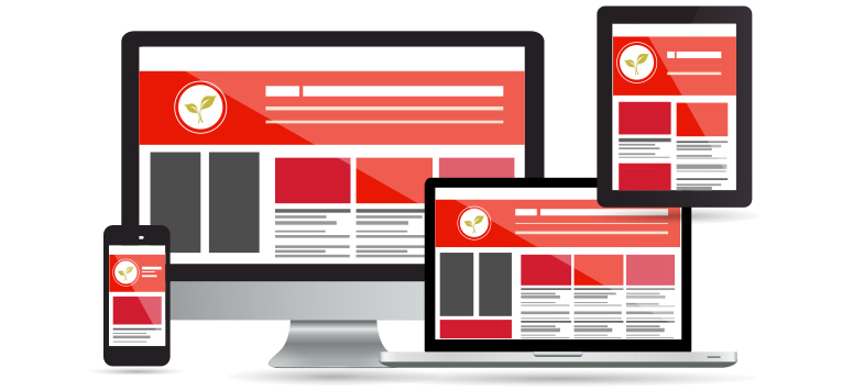
Two out of every three minutes spent online are on mobile devices (comScore). So if your site isn’t mobile responsive, just think about all the potential customers you’re missing out on. Attention spans are shorter than ever, so navigating your site on a SmartPhone needs to be easy and your load times need to be fast.
Strong Call to Action
Believe it or not, your customers actually want you to tell them what to do. They like a clear direction of what action to take next and how it will benefit them. So make your CTAs big and straightforward. Because when you have a captive audience, this is exactly when you have to grab them.
Your Contact Info
This seems obvious, but too many companies are vague about some of this information on purpose, preferring to do everything one way. But if a consumer thinks it’s too difficult to get in touch with you if they have a question or concern, they’ll most likely not even order. A phone number, email, and physical address will go a long way in building trust and credibility. Make sure it is displayed clearly to encourage them to contact you and place an order, visit your store, or schedule an appointment — you know, all the good stuff.
Also note: Live Chats are a great way to encourage conversations too, and 42% of consumers would actually prefer to talk to you this way (JD Power) because of the immediacy and convenience of it.
Timeliness
If your consumers go to your website in June and see your most recent update is about the holidays, it’s not a good look. An out-of-date site raises a lot of questions — none of them good. Adding fresh content regularly doesn’t have to be a major undertaking. If you don’t have a blog, you can also post seasonal specials or news, or you can add a scrolling social media feed so your posts work double duty in keeping your site updated too.
If your site could use a major refresh or just a few updates to optimize your online exposure and drive new traffic, contact shyft to discuss your goals today.
Recent Posts:

